August 14, 2024
With Over 1,400 Creative Visuals Created Every Minute, Yours Can Get Lost—Unless You Master Typography
The difference between a forgettable image and one that resonates lies in your grasp of key design elements. Among these, typography stands out as a critical factor.
It’s what turns plain text into an engaging experience, guiding your audience’s eyes, setting the tone, and making your message unforgettable. Whether you’re crafting a website, a poster, or a brand logo, typography is the key to making your design not just seen but felt.
So, what exactly is typography, and how you can master it? Let’s dive in.
What is Typography in Design?
Typography is more than just choosing a beautiful font; it’s a crucial element, governed by principles of typography, that can make or break a design. Great typography can transform your design from ordinary to extraordinary.
Typography is the art and technique of arranging type to make written language legible, readable, and visually appealing. It’s a fundamental aspect of any design that involves text.
From the earliest handwritten manuscripts to modern digital interfaces, typography has evolved significantly, shaping the way we consume information.

Key Elements in Typography
A range of key elements are essential in principles of typography, each playing a significant role in how text is perceived and read. Understanding these elements is essential for creating visually appealing and readable designs.
🎯 Typefaces and Fonts
Typefaces and fonts are often used interchangeably, but they refer to different aspects of text styling.
- Typefaces define the overall design and shape of each letter, number, or character. Examples include Times New Roman, Arial, and Comic Sans.
- Fonts refer to the specific implementation of a typeface, including its size, weight, and style. For instance, using Arial at 12pt in bold is a specific font.
Typefaces fall into three main categories:
Serif Typefaces
Serif typefaces feature decorative lines or “serifs” at the ends of each character stroke. They convey a traditional, formal look and are often used in print media.
Examples: Times New Roman, Garamond, Courier New, Baskerville, Georgia.
Sans-Serif Typefaces
Sans-serif typefaces do not have the decorative lines found in serif fonts, giving them a cleaner and more modern appearance. They are commonly used in digital media for their readability.
Examples: Arial, Roboto, Verdana.
Script Typefaces
Script typefaces mimic cursive handwriting or calligraphy. They are typically used for decorative purposes and are less readable than serif or sans-serif fonts, making them suitable for headings, logos, or invitations.
Examples: Lobster, Pacifico, Handlee.
Example Application:
- Serif Typefaces: Suitable for printed books and formal documents where tradition and readability are key.
- Sans-Serif Typefaces: Ideal for websites and apps where clarity and modernity are prioritized.
- Script Typefaces: Used sparingly for elegant touches in invitations or branding.
🎯 Kerning
Kerning refers to the adjustment of space between two individual characters in a word. It ensures that the spacing between characters is visually balanced.
- Purpose: Kerning prevents characters from appearing too close together or too far apart, which can affect readability and aesthetic appeal.
- Example: The space between “A” and “V” in the word “AVOID” might be adjusted to ensure they appear evenly spaced.
Example Application:
- Tight Kerning: Used in logos or headings to create a compact, impactful appearance.
- Loose Kerning: Applied in titles or large text where more spacing creates an open and airy feel.
🎯 Tracking
Tracking is similar to kerning but applies to the spacing between all characters in a word or block of text.
- Purpose: Adjusting tracking can make text appear tighter (less space between characters) or looser (more space), affecting the overall texture and readability of the text.
- Example: Increasing tracking in a title to give it a more spaced-out, elegant look.
Example Application:
- Tight Tracking: Suitable for large blocks of text in print where space is limited.
- Loose Tracking: Used in designs where text is sparse, such as in posters or banners, to create a more spacious effect.
🎯Leading
Leading (pronounced “ledding”) is the vertical space between lines of text, also known as line spacing.
- Purpose: Proper leading ensures that text is easy to read by providing enough space between lines, preventing them from overlapping or appearing too close.
- Example: In a Google Doc, adjusting line spacing to 1.5x for better readability in a report.
Example Application:
- Tight Leading: Used in dense text blocks, such as footnotes or captions, where space is limited.
- Loose Leading: Applied in body text or headlines to make the content easier to read and more visually appealing.
10 Principles of Typography (and how to apply them)
Here are the top 10 principles of typography in design that will help you create stunning and effective designs.
👉 Hierarchy: Guiding the Eye
Hierarchy in typography is about arranging text elements so that the most important information stands out. This guides the reader’s eye through the content in a logical order.
▶ How to Apply:
- Use Different Font Sizes: Headlines should be bold and larger, subheadings slightly smaller, and body text the smallest. For example, in a blog post, you might use 24px for headings, 18px for subheadings, and 14px for body text.
- Emphasize with Styles and Weights: Apply bold or italic styles to highlight important words or phrases. For example, using bold for product names in a catalog draws attention to them.
- Use Color and Spacing: Highlight key information by using a different color or adding more space around important elements. For instance, using a bright color for a call-to-action button makes it stand out.
👉 Contrast: Make it Pop
Contrast in typography refers to using differences in fonts, sizes, weights, and colors to make your text stand out.
▶ How to Apply:
- Font Contrast: Use a bold font for headings and a regular font for body text to create a clear distinction. For example, pairing a bold serif font for headings with a light sans-serif font for body text can make your design dynamic.
- Color Contrast: Dark text on a light background, or vice versa, enhances readability. For example, using white text on a black background for a minimalist website gives a modern look while maintaining readability.
- Size Contrast: Make headings significantly larger than body text to ensure they catch the reader’s attention. For instance, in a flyer, you might use 36px for the title and 12px for the details.
👉 Consistency is Key
Consistency in typography means using the same fonts, sizes, and styles throughout your design to create a cohesive and professional look.
▶ How to Apply:
- Limit Typeface Use: Choose one or two typefaces and stick with them. For example, use one typeface for all headings and another for body text in a design.
- Uniform Sizing: Maintain consistent font sizes for similar text elements. For example, all H2 headings should be the same size across your website.
- Consistent Styling: Ensure that the same styles (bold, italic, etc.) are applied uniformly. For instance, all quotes in a presentation should be italicized for a uniform appearance.
👉 Alignment: Order and Organization
Alignment keeps your text neat and organized, ensuring that your design is visually appealing and easy to follow.
▶ How to Apply:
- Left Alignment: This is the most common and easiest to read, making it ideal for most text. For example, use left alignment for paragraphs in a newsletter.
- Centered Alignment: Works well for titles and short blocks of text. For example, centering the main heading on a poster draws attention to it.
- Right Alignment: Useful for specific design purposes, like aligning a signature or a caption. For instance, aligning the date and author’s name to the right on a formal letter can add a professional touch.
- Justified Alignment: This creates a clean edge on both sides of the text but can sometimes create uneven spacing. For example, justified text works well in newspapers and magazines where a clean, block-like appearance is desired.
👉 Readability and Legibility
Readability and legibility are crucial for ensuring that your text is easy to read and understand.
▶ How to Apply:
- Choose Simple Fonts: For body text, choose clean, simple fonts like Arial or Georgia, which are easy to read. For example, using a sans-serif font like Helvetica for an eBook ensures high readability.
- Adjust Kerning and Leading: Ensure there is enough space between letters (kerning) and lines (leading) to avoid crowding. For instance, increasing line spacing in a dense text block makes it more readable.
- Avoid Decorative Fonts for Body Text: These can be hard to read in long passages. For example, while a script font might look elegant in a logo, it’s better to use a simpler font for the main content.
👉 Spacing: Let Your Text Breathe
Proper spacing in typography involves the space between letters (kerning), lines of text (leading), and blocks of text (margin).
▶ How to Apply:
- Kerning: Adjust the space between individual letters for balance. For example, tightening the kerning in a headline can make it look more compact and impactful.
- Leading: Increase line spacing to improve readability, especially in long texts. For example, use 1.5x line spacing in academic papers to make the content easier to follow.
- Margins and Padding: Use adequate space around text blocks to avoid overcrowding. For instance, adding more margin space around a block of text in a brochure can make the design feel more open and inviting.
👉 Scale
Scale in typography refers to the size relationship between different elements in your design, which helps create hierarchy and guide the reader through the content.
▶ How to Apply:
- Varying Sizes: Use different scales for headings, subheadings, and body text to establish importance. For example, a title might be set at 48px, subheadings at 24px, and body text at 16px in a web design.
- Proportional Relationships: Ensure that the size differences are proportional and not too extreme. For instance, in a business card, your name might be 14px, while your job title is 10px, creating a clear distinction without overwhelming the design.
👉 Typeface Choice: Understand Fonts and Typefaces
Fonts and typefaces are fundamental elements of typography that set the tone for your design.
▶ How to Apply:
- Purpose and Tone: Choose a typeface that aligns with the purpose of the text. For example, use a serif typeface like Times New Roman for formal documents to convey tradition and reliability.
- Audience Consideration: As per the principles of typography you must consider who will be reading the text. For a children’s book, a playful, rounded typeface like Comic Sans might be appropriate, while a tech blog might benefit from a sleek sans-serif like Roboto.
- Medium: Adapt your typeface choice to the medium. For print, a serif font like Garamond might work well, while digital media often benefits from sans-serif fonts like Arial for better screen readability.
Pairing Fonts: A Perfect Match
Pairing fonts is the art of combining different fonts to create a harmonious look.
Choose fonts that complement each other and add variety without clashing. A common technique is to pair a serif font (with small lines at the ends of characters) with a sans-serif font (without these lines).
For example, you could use a serif font for headings and a sans-serif font for body text.
Experiment with different combinations to find what works best for your design, but avoid using more than two or three different fonts to maintain consistency.
Examples of Good and Bad Pairings
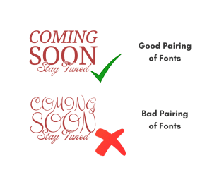
- Good Pairing: A serif font for headings and a sans-serif font for body text can create a balanced and readable design.
- Bad Pairing: Two decorative fonts used together can clash and make the text difficult to read.
👉 Color: Adding Life to Text
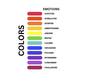
Color in typography adds emotion and emphasis to your design and can greatly influence readability.
▶ How to Apply:
- Color Palette: Stick to a simple color palette to avoid distractions. For example, using a combination of black, white, and one accent color can create a clean and professional look.
- High Contrast: Ensure that there is a high contrast between text and background. For example, dark blue text on a light gray background can be easy to read and visually pleasing.
- Psychological Impact: Consider the psychological effects of color. For instance, using red for warnings or urgent notices can convey a sense of urgency, while green might be used to indicate success or go-ahead signals.
👉 Grids
Grids are a fundamental tool in when learning about principles of typography that help in organizing and aligning text and other design elements.
▶ How to Apply:
- Use Grids to Align Elements: Align text blocks, images, and other elements to a grid to ensure a balanced and organized layout. For example, in a magazine layout, using a 3-column grid can help evenly distribute content and create a clean design.
- Maintain Consistency Across Pages: Grids help maintain a consistent structure across multiple pages, such as in a multi-page brochure. This consistency makes the design look professional and polished.
- Create Visual Flow: Use grids to create a visual flow, guiding the reader’s eye through the content. For example, placing key information along the grid lines ensures that it catches the reader’s attention first.
Get Better at Typography with These Pro Tips
Typography can make or break your design, so getting it right is essential. Here’s a quick rundown of 10 essential tips to learn the principles of typography to help you improve your design game:
⭐ Justify Left
Align text to the left rather than centering or justifying it. This makes it easier for readers to follow, as they can always find the edge of the text quickly.
⭐ Use One Font
Stick to a single font for your designs. Mixing fonts can be tricky unless you’re sure they complement each other well. Master one font before experimenting with others.
⭐ Skip A Weight
When changing font weights, make noticeable jumps (like from light to bold). Small changes can be hard to spot, so go for more contrast to make important elements stand out.
⭐ Double Point Size
When changing point sizes, double or halve the size for different text elements. For instance, use 15 pt. for body text if your headline is 30 pt. This creates a clear hierarchy.
⭐ Align To One Axis
Keep your type aligned to a single grid line or axis, whether it’s vertical or horizontal. This consistency helps maintain a clean and organized layout.
⭐ Pick Any Font
You can use a wide range of classic fonts like Helvetica, Garamond, or Futura. Just ensure it fits well with your design.
⭐ Group By Using Rules
Use lines or shapes to group related information. This helps make the design look more organized and coherent.
⭐ Avoid The Corners
Don’t place elements right at the edges or corners unless it’s intentional. Allow for negative space to keep your design breathing and uncluttered.
⭐ Mind The Gap
Spacing is key. Avoid forced justification and pay attention to gaps, widows (single words on a line), and orphans (lines or words separated from their paragraph). Consistent spacing makes for cleaner text.
⭐ Be Bold or Italic, Never Regular
Use bold or italic styles to emphasize text rather than relying on regular weights. This adds variety and emphasis where needed.
These rules will help you create clean, effective typography in your designs.
💡Bonus: 5 Best Typography Tools & Resources
Adobe Fonts
Adobe Fonts offers a vast library of high-quality typefaces that are fully integrated with Adobe Creative Cloud. It’s perfect for designers looking for a variety of fonts for print and digital projects.
USP: Extensive Library & Seamless Integration
Google Fonts
Google Fonts provides a large collection of open-source fonts that are optimized for web use. It’s ideal for web designers who need fast-loading, versatile fonts that work across all devices.
USP: Free & Web-Optimized
Font Squirrel
Font Squirrel curates a selection of free, high-quality fonts that are legally licensed for commercial use. It’s a go-to resource for designers needing premium fonts without the cost.
USP: High-Quality Free Fonts
What Font
What Font is a browser extension that allows users to identify fonts on websites quickly. It’s a handy tool for designers who want to discover and analyze fonts used in existing designs.
USP: Easy Font Identification
Typekit Practice
Typekit Practice offers tutorials and practical guidance on principles of typography, helping designers improve their typographic skills. It’s perfect for those looking to deepen their understanding of type design and application.
USP: Educational Resource for Typography
Conclusion
Typography is a powerful tool in design. By mastering these principles, you can create designs that are not only visually appealing but also easy to read and understand.
Practice is key, so keep experimenting with different fonts, sizes, and styles to see what works best for your projects. Remember, great typography can make a huge difference in how your design is perceived.
At Pixel Street, we specialize in creating visually stunning and highly functional designs that capture your brand’s essence and engage your audience.